Tasteat
UX/UI for a hotel-oriented, local food delivery platform
The Project
Tasteat is a B2B2C product that connects short-term rental property owners with local food and beverage businesses to give their guests the opportunity to discover the area through local products. One of the unique features of the product is the ability for users to order from multiple food vendors through a single order and checkout process.
My role in this project was that of the UX/UI designer and I got involved right after the main stakeholders defined the business requirements of the product.
Apart from me, the team consisted of 4 more people of different disciplines. More specifically: A full stack developer, a front-end developer, a project manager and an account manager.
At a later stage, more developers where added, to support our scaling efforts, as well as a QA tester.
The Structure
The product included 3+1 main type of users:
- The Suppliers: Suppliers include the restaurants and food vendors. Their use of the product includes setting up a menu with all the products they offer and managing their orders.
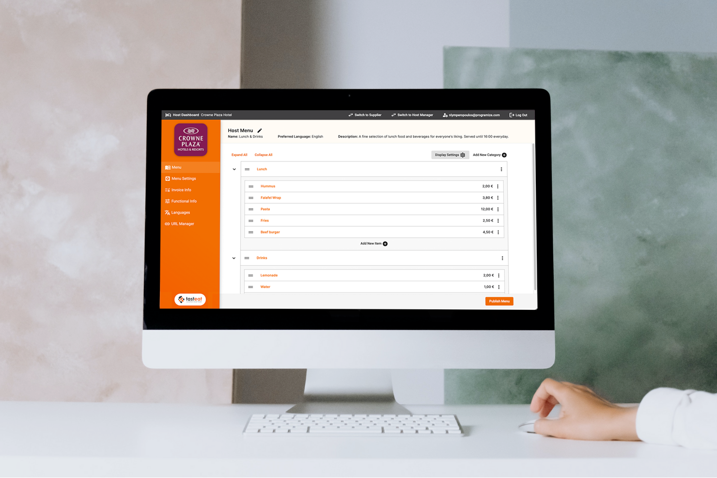
- The Hosts: Hosts include hotels, Airbnbs and any other form of short term rental properties. Their use of the product includes inviting local restaurants to the platform and creating a custom menu for their guests, based on the local suppliers. Even though they are not actively managing orders, they are also given the ability to keep track of them. Clients may also have the role of a supplier, if they offer food and/or beverages.
- The Guests: Guests are the end-users of the product and are the people that make the orders from the local food vendors.
- The Operators: Operators are the last “extra” user type which are the super-users of the system that could do all sorts of tasks like accepting and canceling orders on behalf of any supplier or host, make changes to the menus and more. Therefore, operators had a supporting role in the system.
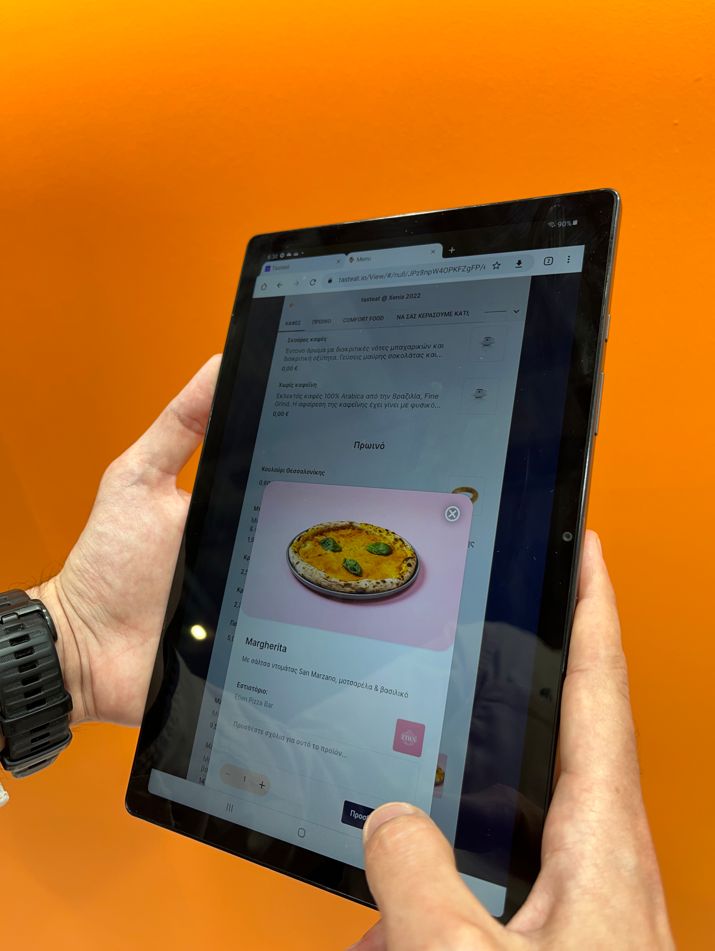
How it works
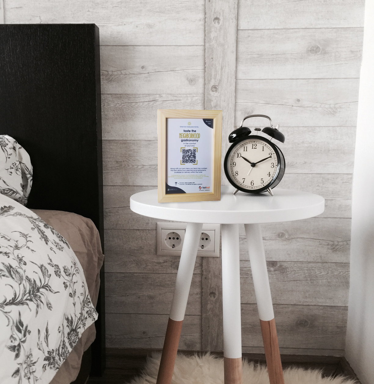
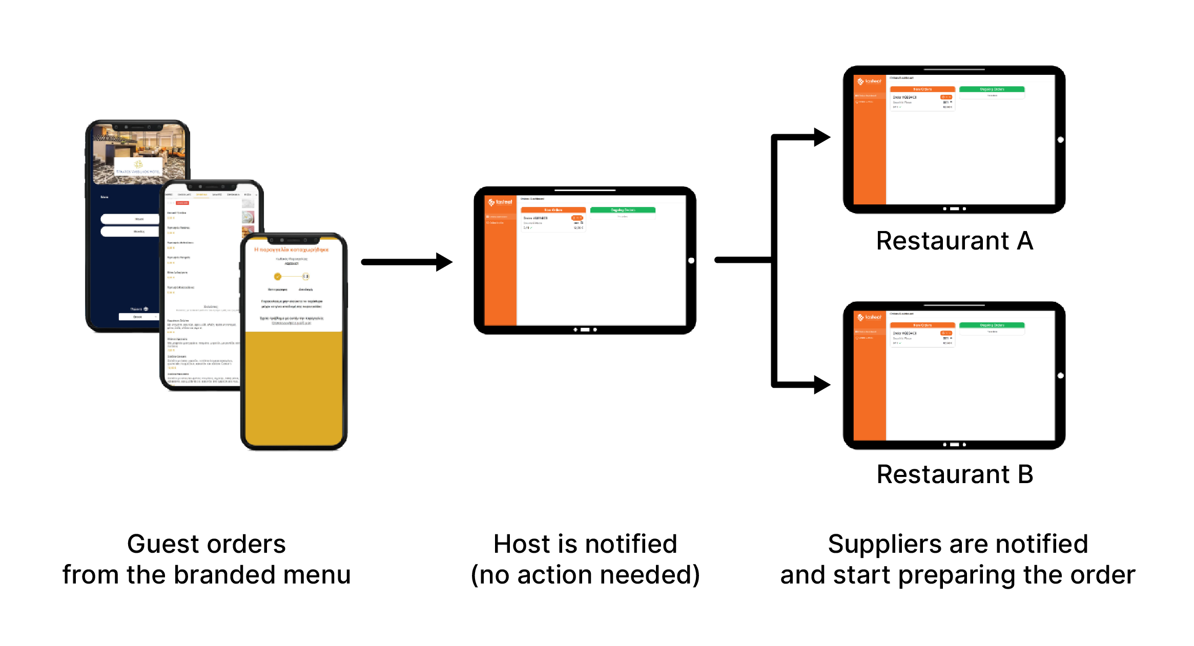
The use flow: The typical use flow of the product starts with a guest making an order by scanning the QR code inside their room and then browsing the available menu, selecting one or more items and completing the checkout.
Then the supplier, or suppliers in case they ordered products from multiple vendors, get a notification with the order as well as all the needed delivery information.
Following that, the supplier(s) need to accept or decline the order within a set timeframe (currently 2 minutes) and state the time needed to deliver it. Once supplier(s) have responded to the order, the guest receives a notification with the estimated delivery time.
When the order is successfully delivered to the guest, the order is completed.
The approach
The initial time frame for shipping the MVP, which included making the product usable at a basic level with all necessary features, was about two months. To meet this deadline, we did multiple short sprints ranging from three days to one week, following the steps shown in the image below:
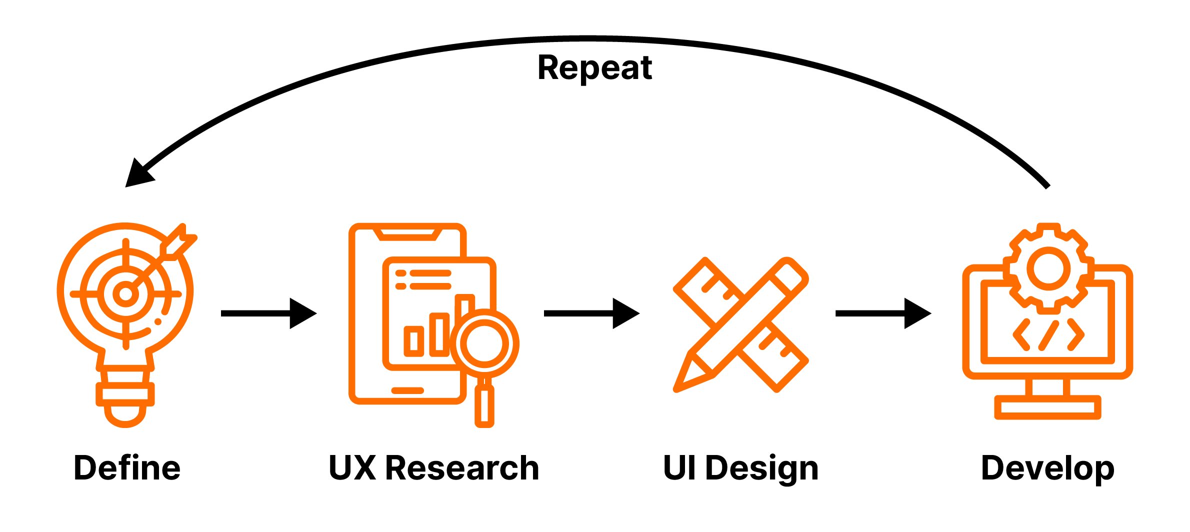
In terms of UX/UI design, my process typically involved researching each feature by analyzing competitive products and compiling requirements, coming up with ideas, and creating flow charts and information architecture charts for each screen. I would then iterate on these charts with the rest of the team to finalize the navigation. Afterwards, before starting with the UI design, I created an extensive design system that enabled me to easily create medium to high fidelity prototypes quickly, without the need of going through wireframes, which ended up saving a lot of time. After some iteration on the UI design with the team, I would hand off the design to developers for implementation. Finally, I would usually do a QA session with a developer to ensure the UI had been implemented correctly.
Completing the MVP
After about two months and multiple sprints, we completed the MVP and started preparing the platform for pilot testing in our first hotel. In addition to the hotel, we found three restaurants near the hotel that were eager to start offering their services through Tasteat. The MVP included the following main features:
- Order scheduling
- Restaurant working hours
- Fee implementation
- Configurable payment and delivery methods
- Charging the hotel’s card
- Item availability
Testing the MVP
During the first "pilot phase," we tested all aspects of the product to ensure that everything was working well and identify areas for improvement. We did this through two separate sessions: a user observation session and a user testing session.
- User observation: We observed users (restaurant employees) interacting with the product in a supplier's restaurant, encouraging them to share their experiences and conducting a short interview at the end. While we could collect more detailed data using other methods, observing users was a quick way to get an objective view of the product.
- User testing: We tested the guest features of the product internally with 12 co-workers who had no prior knowledge of the product. They were given two scenarios designed to utilize all basic features of the product, and we observed them and took notes. We then conducted a System Usability Scale test and a short interview to gather additional insights. Overall, the results were good and we didn't find any major issues with the user flow, but we did identify several minor usability issues that we later improved.
Interactive Prototype
After the MVP
After a successful initial launch and a round of testing, we made easy fixes and improvements, and created a roadmap for the upcoming months that included enhancing existing features and adding new ones. We also began introducing our product to more rental properties and within two months, we had expanded to four more hotels and around 12 Airbnbs.
I decided it would be productive to change our approach to developing each feature. My main goal was to spend more time researching and exploring before moving on to UI design. I then proposed this new process to the team, which was approved.
The general approach included researching and analyzing competitors, conducting an exploration workshop using tools such as user journey, empathy map, and pain points, involving the team in planning the feature's high-level functionality and content, structuring the user navigation and information architecture and then checking in with the developers for feasibility, and finally designing the UI. For more complex features, we also conducted user testing before the production release.
Analytics
Once we had successfully implemented the product in multiple locations and had a growing number of real users everyday, we started implementing Google analytics and then setting them up in order to get useful information about users and our product.
We started by setting up a series of events that we could track, as well as adding different properties for those events. For example, the first event was coming from the menu being loaded. This event also tracked two properties, the room name and the hotel name. That way, we would know in detail how often a a QR code was scanned and exactly from which location. This was very useful to figure out if the QR codes were placed correctly inside the room as well as get an idea for which hotels had the most traffic.
Other information we managed to get out of analytics were the most common screen sizes and devices of our users, the conversion rates, the number of new and unique users each day or week and more.

